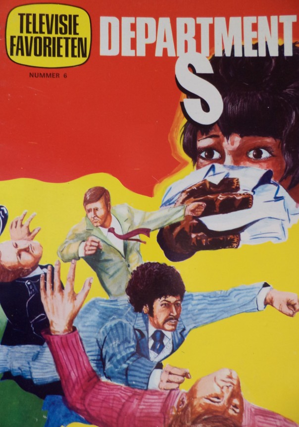
Few images sum up the dashing Jason King, as played by actor Peter Wyngarde in the television series Department S (1968-69) and Jason King (1971-72) more than the sight of a stocky, jowly bloke with an afro in a pin striped suit flying through the air, fists-flying. Oh yes, The Professionals had nothing on Jason “the bruiser” King…
Except perhaps the tiny but insurmountable detail that the above image, used on the cover of a Dutch TV Comic book, is completely at odds with the way the character was portrayed on TV. But then you already knew that. But that doesn’t make it any the less charming in its absurdity. The past is a foreign country, of course, but twice as foreign when it comes to translating a TV series concept for local merchandising. Which is why I’m not going to even attempt an article on the dark corners of warped reinvention where the likes of Jason King, UFO and The Persuaders found themselves when European merchandising companies got their clammy hands upon them.
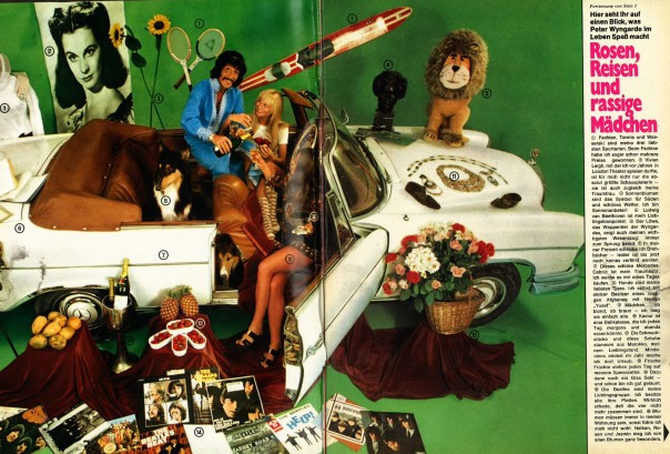
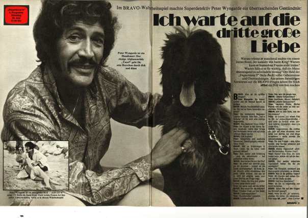
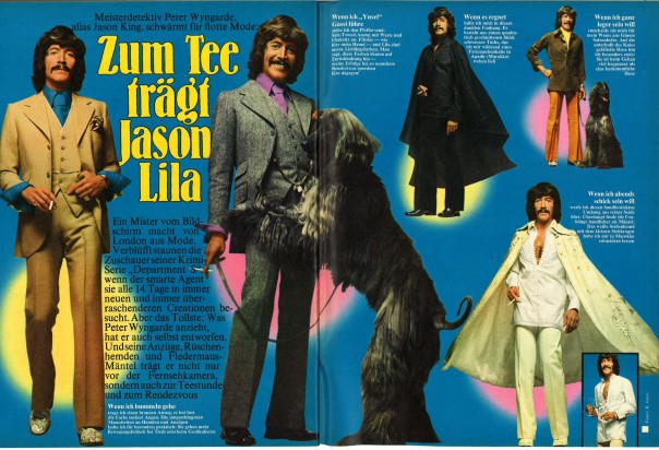
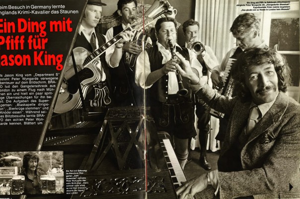
A far less absurd but just as exuberant way of selling Jason King was the lightweight celebrity photo-spread, and no magazine of the early 70s seemed to be more accomplished at this that German TV listings journal Bravo. I say thus with utterly false authority by the way. It could feasibly be the case that Australia, with its legions of Wyngarde fanatics, did just as good a job of covering the King phenomenon. But let us forget Australia for now (see, easy wasn’t it?) and revel in the truly exceptional coverage Bravo gave to both Department S and Jason King on first transmission in a series of snippets recently unearthed by researcher and archivist Bernard Dunne, a man for whom the phrase “no stone un-turned” certainly applies. Next stop for him: Australia. He just doesn’t know it yet.
Anyway, here’s a gallery of Bravo’s bravura spreadage:
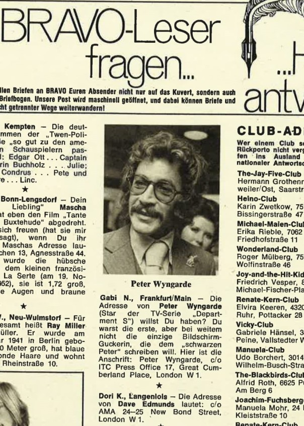
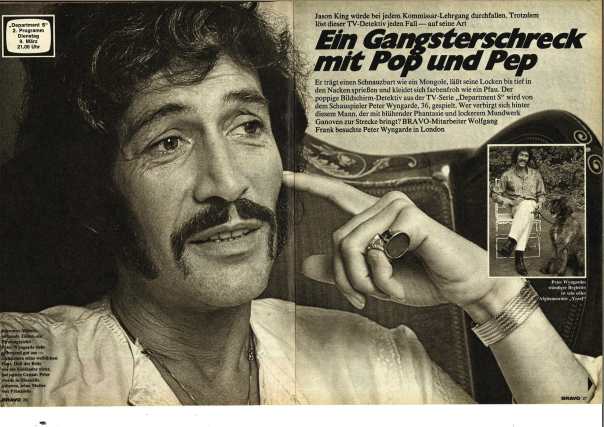
Peter Wyngarde’s favourite things!“How can I find Jason King?” Bravo to the rescue…
Reflections…
Meet the houndSensational stylingsNo translation required (er, can anyone translate this?)
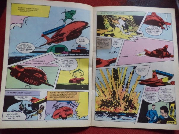
There really is no accounting for taste. Where TV21 was the gold-standard of Gerry Anderson publishing, TV2000, the Dutch offshoot, was a pale imitation, devoid of the elan that made the original so memorable and enduring. Most of what was great was messed up. The covers were badly reproduced rehashes of the original. Design, such as it was, lacked the quirky futuristic innovation we had come to expect. The paper quality and reproduction was plan awful. Hell, they couldn’t even set it in the right Century. But strangest of all these shoddy faux pas was the re-colouring scheme which took the original epic artwork of TV 21 and did things like…well like this…
Note the way Thunderbird 3 changes colour from red to blue within the same story. This is very much the way of things with foreign representations of Anderson brands around this time (see ‘Carlo DiFonzio: The Fotobusta King’ for more of the same).
Here’s another choice example:
Now this one I quite like. A red Thunderbird 2 would have looked pretty good on-screen. People (well, nerds) are wasting their lives away in 2016 building customised versions of these famous TV craft as though red TB2s are some kind of new thing but no; there it was, loud and proud flying around the childhood bedrooms of Holland circa 1967. Maybe Dinky should also have done a red version? Wouldn’t have put it past them.
TV2000 also gave us their own take on collector cards which, for my money, are somewhat more interesting than the comic itself. Note how uncomfortable Virgil Tracy appears here:
He must have seen his craft’s the colour scheme beforehand.
And when our Dutch compadres weren’t ripping off the original UK comics, they wee ripping off the original annuals…
Lazy, edam-eating twerps
Many years ago I stopped by Amsterdam with a hobbledihoy and telefantasy researcher of my long acquaintance. While I perused the excellent art galleries and waterways of that fine city, I couldn’t help but notice he was constantly slipping off down neon-lit alleyways and returning lighter of wallet, his eyes slightly glazed. I have to say the experience changed him rather fundamentally. I never saw him again after this excursion although I did hear that he got a job working for Gerry Anderson only to lose this coveted position when he was caught attempting sexual congress with a puppet-sized model of Supercar.
John Tracy of International Rescue stands in his famous red uniform at the control console of Thunderbird 5 in its traditional location in a cave next door to the distinctive super-craft, Thunderbird 1. Which is also red.
Welcome to the uniquely strange world of Carlo DiFonzio, the man who – for nearly 20 years – came to define the world of Italian cinema promotional material. Through literally thousands of distinctive portrait-sized “locandinas” and more traditionally landscaped “fotobustas”, DiFonzio consistently mis-represented, mis-interpreted and just-plain missed the filmed image in favor of something far more interesting – a garish alt-universe of his own creation. In recent years, art lovers the world over have rediscovered DiFonzio’s hand-tinted oeuvre, with posters changing hands for hundreds, sometimes thousands of dollars. But who was Carlo DiFonzio, why did he create such unusual imagery and what is his true legacy today?
“My father was a great man, but…he had his problems” It’s noon at a pavement cafe in the quiet central square of the the tiny Italian village of Salviatini, just north of Milan. I’m here to speak to and, as it turns out, enjoy a few drinks with DiFonzio’s son Dino, now a craggy 58, the oldest of 12 children. Its fair to say his memories of his father are conflicted: “He would paint or do his photo montages for the film posters all day and in the evening he would go out and meet with these crazy people, these other artists. They would drive up to the mountain behind the village here, you see the one? They’d go up there and smoke the ayahuaska , you know? That’s the real strong shit! When he’d come back the next morning he’d start work again and none of the colors made any fucking sense…” His voice trails off as he stares into his large whisky. A vivid image of his father, crazed with the insanity of a night at high altitude on mind-bending ayahuasca, is forming in my mind. Suddenly, to my amazement Dino reaches into his trousers and produces a photograph that actually shows his father in the midst of a 1970s drug trip…
“This is one of the few images I have of him” Dino sadly relates “He hated being photographed but this one was taken by a guy who was making a documentary about the origin of locandinas and fotobustas in this region. He waited in the bushes until my father was completely fucked out of his head and took this image of him and his friend Sergio in the full grasp of the drug trip” It certainly is an enduring image, one that goes some way to understanding the bizarrely ersatz versions of familiar film and television properties that DiFonzio reveled in.
Yours for £1,375,000
In October of this year, a mint-condition copy of DiFonzio’s most famous image, the legendary ‘Red John’ fotobusta for the film Thunderbirds Are Go! (1966) sold at Sotherby’s in London to a private collector for an astonishing £1,375,000. It was the largest single price ever paid for a movie poster. Does Dino wish he’d kept any of his father’s original works? “I did! They’re all over my wall at home, but back to front! I plastered them up face down to make a white background to paint on because at the time I couldn’t afford any fucking wallpaper!” And what does he think of the people who now pay more that the price of a large Italian villa for a single mint condition DiFonzio locandina? “What do I think?!” With this he staggers to his feet, nearly spilling our beers, unzips his fly and does something both hilarious and grotesque with his penis “THIS is what I think! These stupid fucking asshats who pay all this money can have THIS!”
Another splash of red from the Maestro…
The ‘Red John’ was followed by a string of similarly bizarre, drug-influenced creations. Almost as strange, and recently acquired by George Clooney for £968,000, is the ‘Red 4’, DiFonzio’s unhinged depiction of Thunderbird 4 and the Tracy Island Roundhouse from the same 1966 Gerry Anderson film.
“It’s like something took over his mind to make everything red” muses Dino, calmer now and drawing heavily on a fresh, high-strength cigarette, “He had a thing about red, for sure, but he also had a thing about green. And blue, he also had a thing about blue as well…” Indeed, the cornucopia of rainbow expressionism that flowed from DiFonzio’s tinting studio located in a converted toilet cubicle in a narrow corridor above a bar a few doors down from where Dina and I now sit, seemingly held no bounds. His contract with Italian distribution king Luigi Tagliatelle gave him first choice on any Italian film releases…”And what did he choose to do?” an increasingly emotional Dino splutters as a another round of San Miguels appears at our table, courtesy of Traci, our comely waitress “He chose shit! These fucking English TV episodes all joined up into these shitty movies that weren’t proper movies. He could have done the Fellini posters, the Antonioni’s, but no!” he flings his arms up in he air in a way only an Italian man at the end of his tether can do. “I was at home with him and my poor old Moma in her worn out knickers the night he got a call from the studio to offer him the poster for 2001: A Space Odyssey (1968). He says down the phone ‘OK maybe, but what else you got Luigi?’ They tell him they got some fucking compilations of The Saint, you know, Roger Moore? That cunt?” Dino’s eye’s are now bulging with anger “You know how much he would have gotten paid for the Kubrick movie poster job? Ten times as much! I wanted to go to college! Jesus…Anyway, lets have another pint of this, yes?”
Although its seems an inopportune time to mention it to Dino, the irony today is that the two Saint posters his father produced that year, both featuring his now trademark “red man”, now change hands for many thousands of dollars more than the original Italian 2001 poster.
But its not quite true to say that DiFonzio never worked on any major Hollywood films, in fact he even invested some of his earnings in a film he had high hopes for, as Dino recalls.. “There was a Disney film he had some money invested in, he really thought it was going to be a big success, it was called Monkey’s Go Home! He did the poster and fucked up all the colours and everything but it was a turkey. I don’t know why but they never show it it on TV. But he would jump up and down with excitement whenever he heard the name”.
Monkey Go Home!…gone!
But there would be one other, incredible, brush with big-time Hollywood movies and it all came about through a mis-understanding, as Dino recalled to me over another brace of foaming Miguels…”By the late 1970s my father was spending most of his time fucked out of head on drugs and doing posters for just a few things he liked. He liked The Persuaders, he liked Space: 1999, he really – I mean REALLY liked that show with the girls with the tits and the purple wigs (Gerry Anderson’s UFO) but that was all he’d do, you know? Just TV shit that got shown out here in the provinces. People out here will watch any old shit! Anyway, one day in 1977 he agreed to do the poster for what he thought was a new Gerry Anderson movie compilation. That’s what the studio had told him. But it was a trick to get him to do the poster for Star Wars!”
Replete with his trademark tinted weirdness, it would prove the final work of DiFonzio’s career. Not that the story ends there…
“My father disappeared with his friends from the mountain camp, the drug people. They all took off and we never heard from him again.We heard about him sometimes, but never from him. I’m not sad though. My father, you know…” For a moment, as Dino stares down into his seventh San Miguel, I see the little boy DiFonzio left behind “…was an idioti, a fool. He was a….a loser. But he was still my father”
In a quiet square in a small village near Milan, a very drunk man begins to cry.
Of all he great artists of the late 20th Century, Carlo DiFonzio is perhaps the most enigmatic. With just one confirmed sighting since 1977, we can only guess at the lifestyle he now leads. But in that single 2006 image of DiFonzio doing his shopping in Ealing, West London, we can still see something in his eyes.. the artist, the fool, the man who saw in red…the King of the Fotobustas, walking tall.
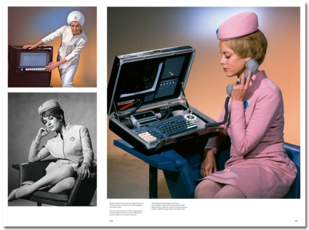
Stanley Kubrick was right about the future in so many ways and that includes what he created but ultimately chose to exclude from 2001: A Space Odyssey. This “miniature” briefcase computer was designed and built for the 1968 movie (filmed between 1965 and 1967) but wasn’t prominently featured. And a good job to – its superbly dated in a way that other 2001 designs aren’t. I can easily see this featuring in The Andromeda Strain, Phase IV or any of those 1970s hard SF films that took great pains to avoid the march of miniaturisation by showing computer technology of the future as it was back then – banks of giant free-standing IBM behemoths with whirring tapes reels and chunky keyboards. Which, of course, are wonderful to behold, as I realised once again while watching the excellent Captain America: The Winter Soldier with its World War 2 supervillain Arnim Zola still “alive” in the 21st Century through the magic of 1970s solid-state technology. And that means great big banks of these…
This is of course a scene from Gerry Anderson’s seminal treatise on unwieldy but aesthetically pleasing supertechology UFO – a show so steeped in cool retro computer banks Anderson had the idea of starting a leasing company to rent out the expensive contents of SHADO HQ and its attendant Moonbase to other productions in need of similar futuristic adornmants. So it was that this:
…turned up a few years later in Doctor Who as this:
…and – famously – in this:
Indeed, the preeminence of UFO’s consoles and flashing lights within the fibre of TV and films through the 1970s and into the 1980s (they were in loads more Doctor Who plus Timeslip,Blakes 7, someBond films, The Muppet Show, The Goodies and oodles more) may have had the inadvertent effect of holding back the fictitious on-screen march of technological progress, rendering Kubrick’s sleek Hal 9000 interfaces that much more startling in comparison. But think on this: maybe it was all a devilish plot by Gerry Anderson and his good lady wife to deliberately retard everyone’s vision of the future so that they could catch us all napping with this…
Perhaps in the vain hope that people wouldn’t click that it was entirely and gratuitously ripped off from this…
Which is why, as his internal memos later revealed, Stanley Kubrick gave serious consideration to suing Gerry and Sylvia Anderson. But if you’re trying to predict the look of the future, as Kubrick very much did with 2001, you can’t really complain if people think you’re right and use the same aesthetic feel in their own show. Helped greatly by having an SFX designer borrowing liberally from his own contribution to your film. I suppose that’s all fair enough, that’s all all in the game.
Apart from this…
…which is just ridiculous.
No, while I think Kubrick’s issue was certainly compounded by all the visual similarities and glacial styling, the real crux of the issue was that episode 1 of Space: 1999 was a thinly-veiled re-telling of 2001’s Heywood Floyd sequence. Okay, call it a homage.
The Sensorites. Here’s (not) looking at you, guys…
Bit of a fan, me. I got Terrance Dicks to autograph my copy of The Making of Doctor Who at a Target Books promotion at my school in 1977, I audio-taped Logopolis part 4, I bought Doctor Who Weekly issue 1, I went to a convention at Imperial College in 1987 when no one was watching the show on TV anymore, I’ve drunk with Andrew Pixley, I’ve criticised JNT in heated pub debates with DWAS luminaries. All that stuff and more. But most of all, to prove my allegiance, I’ve got all the classic series DVDs. Every single one. Haven’t watched them all yet, obviously.
The ironic thing about all these missing episodes re-appearing and being greeted as “new-old” Doctor Who by fans is that, for many us there’s still a whole shed-load of episodes that aren’t missing that we haven’t seen yet. Not because we don’t intend to, its just we’re taking our time over it, us tardy fans – things to do, people to see, you know how it goes. So while it’s great to have The Web of Fear back (and I’ve watched it twice now, just to make sure), that doesn’t mean I’m some kind of archive junkie waiting for my next fix of previously unseen old Who. Because I’ve got a whole fresh supply of the purest stuff right here on my DVD shelf to keep me wired to my vortex manipulator (to completely over-extend the drug analogy) for ages, man. I mean, wow, the stuff I haven’t seen…
Planet of Giants
Never seen it, except to check out the Ian Levine restoration of part 4. Which was fucking terrible. I really should have watched the actual story but oh no, I jumped straight to the Levine thing. That’s how much of a fan I am.
The Aztecs
I’ve tried to watch this twice now, dammit I’ve even paid for it twice what with the Special Edition coming out and I still can’t get past Episode 1. It’s supposed to be really good, right? Well why does it put me to sleep? Answers on a bejeweled parchment.
The Romans
Marvelous story, sublime performance from Hartnell, tremendous sets, sparkling script…Never seen past Episode 1. I probably got a bit tired as I’m a “nighttime consumer”. Its what happens when you have a life and have to stay up late to enjoy these things but it didn’t prevent me from watching The Ark this week. Good story, The Ark!
The Space Museum
Just sitting there, unwatched…
The Gunfighters
I did watch Episode 1 and it was surprising good. Lovely sets, good performances, well directed. But then I remembered how much more fun The Time Monster is and started watching that again. Yes, The Time Monster and yes, again.
The Ice Warriors
Yeah, I saw it on VHS and it it was…well, a bit dull. But it’s Troughton so I will watch this soon. Perhaps. I do think though that it’s really important to try and come back to things fresh and watch them on their own merits. So I’ll try and think “not dull” when I watch it.
Then there’s the stories I saw on first broadcast but have avoided ever since, for one reason or another…probably in order to re-watch The Time Monster or The Chase again, both of which are just bonkers fun. Especially The Time Monster, as you know.
“…its got cartoon bits and everwifink…”
The Monster of Peladon
I must have seen this in 1974 when I was five but I’m buggered if I’m going to watch it in 2014 when I’m 45. I’ll wait until I’m 50. Or until somebody offers to pay me to write a book about how I was a withdrawn, rather lonely child but Doctor Who became my escape into imaginative freedom and now I’m watching it all over again in the company of my hilarious pet monkey. Because we need more of those sort of books, don’t we?
Here’s another box set I’ve bought twice and not watched. I mean, of course I fancied Mary Tamm, of course we all loved Tom, of course as kids we though K-9 was cool. Its just at the time I found this whole year completely forgettable and for some reason can’t be asked to watch the DVDs. Which is doubly odd because if I watched the DVDs, they’d help me remember why I found it completely forgettable…
Lovely box, though. Nice shade of pink. Be a shame to take the shrinkwrap off, if I’m honest.
Meglos
Here’s one I genuinely might have missed as an 11 year old because you-know-what was on ITV. Yes, Erin Gray in a spandex bodysuit. Shame that Jackie Hill returned to the show in a less-than-lauded story but that DVD cover looks intriguing…
But I was watching this:
…which trumped Tom Baker as a cactus hands-down,
Four to Doomsday
Early Davison (makes strange cliicky sound with his larynx)
The Visitation
Ditto (ditto)
Time-Flight
Do I detect a pattern forming here?
Warriors of the Deep
Here’s another one I stopped watching in order to watch The Time Monster. I really should watch this though – visually it’s got a sort of Space:1999 vibe to it, as I recall. Thinking about it, perhaps I was watching Space:1999 instead of The Key to Time season?
“Space:1999” take a break, yesterday. Patrick Mower just out of shot.
Trial of a Timelord
They should have just found him guilty and regenerated him at the end of Episode 1 and time-jumped straight into…
What a charming chap Peter Cushing was. I never me him but many, many people who did attest to his unstinting politeness, innate patience and all-round decency.
Which makes his career as one of the UK’s premium fear-bringers all the more delicious and enjoyable. Take Corruption, for example. Produced in 1967 and released the following year, this delightfully macabre effort from the pen of Derek (“King of the Export Versions”) Ford has been little seen or remarked upon since its initial release but thanks to Grindhouse Releasing we can all see it restored to a condition that, frankly, I doubt it ever sported in the first place. Not a Hammer production, it pushes the boat out further than most UK horrors of the era and may be an interesting diversion for anyone seeking some spicy 60s obscura, albeit produced with the comfortingly colourful elan of an ITC film series.
Grindhouse Releasing’s delightful 2013 cover image…Joe Spinell would approve.
Cushing plays super-surgeon and adoring older husband of 60s superchick Sue Lloyd (this was a low budget affair). Sue is a big fan of Antonioni’s Blow Up and, as it’s 1967, is apt to go all Jean Shrimpton at the merest whiff of a photo opportunity. Dragging poor old hubby Peter to a happening party full of swinging young things, Sue throws herself into an impromptu modelling session with David Hemmings’ slightly less buff twin brother played by Tony Booth (like I said, a low budget production). Amid all the “come on baby, gimme more!” patter from Tony and increasingly sexy posing from Sue, old Peter starts to feel a bit de-masculated. Finally, inflamed to breaking point, he snaps and wades in with both fists to teach sleazy snapper Booth some old fashioned manners and a brutal fracas ensues. Now this scene is remarkable on a number of levels but the one I’ll point out is the peculiar way Cushing’s trademark high-pile hairstyle comes completely unstuck from his bonce and swings out from side to side during the fight in a way that evokes a demented PJ Proby. Honestly, I was mesmerised.
Things reach a flash-point, as it were, when these two fighting cocks send a giant arc lamp smashing down on Sue’s face, rendering her horribly deformed. Either that or someone has dropped a rubber trick-vomit on her cheek – you be the judge…
But all is not lost as Cushing is still a brilliant medic (do keep up) and finds a way to transplant the adrenal gland from the neck of dead woman in his hospital morgue into suffering Sue, thus repairing her mutated phizog as if nothing had ever smashed violently into it in he first place – Result! But the process is short-lived and soon poor Sue is back to looking like someones used her face as a barbecue, a circumstance that sends her a bit Bette Davis, truth be told. Insane with a demented obsession to repair her ravaged mug and get her modelling career back on track , she corrupts poor devoted Peter into going out into the Soho night to murder a prostitute for another dose of reviving adrenal gland-ness. This he does not once, but twice. The first time the scene is performed for the UK version of the movie with an actress who keeps her top on. The second time, filmed for the so-called “international version” its an altogether more brutal undertaking, filmed with a different actress who performs the same scene topless. Now this is where things get really weird, as it appears to be Cushing himself performing the export-only bloody throttling and stabbing of the semi naked whore, making this easily the most extreme scene he ever took part in. I’m sure he was an utter gentlemen about it, though (the old rogue).
From here on it’s Eyes Without A Face on the Kent Coast as sneaky Peter sets about luring a perky teen (excellent Wendy Varnals, playing much younger that her 26 years) to a similar fate at the couple’s clifftop retreat. The finale involves Kate O’Mara, laser beams, a hail of sparks and pile of bloody corpses. C’mon, you know it makes sense.
What a turn up! Corruption is a blithely demented slice of quality sleaze with a prime-period Cushing performance to relish. I can think of no better way to pass 90 minutes some stormy winter evening. The DVD/bluray set is excellent with all the various versions to compare and contrast and a great set of cast interviews, trailers and posters. Rarely has so shadowy a movie been so lovingly resurrected.
Derek’s World: Original concept art for Thunderbird 2 by Derek Meddings
You know that song by the Bee Gees, “New York Mining Disaster“? It’s always reminded me of Thunderbirds; specifically the episode Terror in New York City which depicts a disaster of 9/11-style magnitude involving a skyscaper collapsing into a giant sinkhole. It was one of those “holy shit” moments Thunderbirds strived for every single week; the giant plane that lands on three elevator cars only to slew off them and burst into flames, the man lowered into a flaming pit only to be winched back a screaming smouldering wreck, the monorail tearing down upon the woman strapped across its path, the Atomic Plant blown to smithereens by the clockwork rat…
The other thing about the Bee Gees that reminds me of Thunderbirds (and I’m only scratching the Gibb/Birds surface here) was their toothsome ubiquity in the pages of spin-off comic Lady Penelope, in which they would regularly pose in variety of cool slacks and velveteen jackets looking for all the world like they’d been styled by Sylvia Anderson herself. And there were five of them then, of course, before the core trio of Barry, Robin and Maurice (or “Pilly”, “Potty”and “Pissy”, as their roadcrew affectionately called them) became the scary, hairy disco demigods whose world we only lived in in the late 70s
Scarily hairy: the Bee Gees mutation begins…
But back then they were clearly channeling the Tracy brothers-5, both in their net personage and preoccupation with widescreen disaster. The evidence is overwhelming, not to say suffocating: Gerry Anderson‘s inspiration for the underlying concept of Thunderbirds was the 1963 West German mining disaster that later came to be known as the Wunder von Lengede (“The Miracle of Lengede“). The Bee Gees saw exactly the same story (probably) and wrote their song about it- adding in the extra “1941” so that Gerry wouldn’t sue them although I’m sure its all water under the bridge now that most of the parties involved have gone to the hereafter. Mind you, I see Barry’s about to do a solo tour. I’m not sure how much further I want to take this analogy but let me just leave you with a mental image of these men five as stars of an alt-universe live-action Thunderbirds series; a few years later and I suppose it would have been called Thunderbeards, but that wouldn’t have been as good with just the three of them.
Saturday mornings in 1981 were made for Thunderbirds – a 48 minute shot of (rerun) adrenaline that ejected me out into the great outdoors before lunch with a head full of exploding Crabloggers, bursting dams and buckling suspension bridges. I suppose it was more of a boy’s show but I must confess to preferring the episodes that centered on Lady Penelope , what with her being such a brilliantly cool and slinky madam. And that car sort of ruled too, wouldn’t you say?
It’s amazing how little regard Anderson had for small-screen convention with Thunderbirds. The series stands alongside The Prisoner and The Avengers as one of the supreme filmed adventure series of the 1960s, but more than even those peerless creations, Thunderbirds bounds gleefully away from any preoccupation with smaller-scale stories or limited settings, a hallmark of the previous series Stingray, and instead makes (nearly) every episode an international travelogue of Bondian ambition
And to bring this up-scaled world so vividly to life, here at last are the vast roadways, railways, airports, city-scapes and installations the previous Anderson series could only hint at. Here are eye-boggling phalanxes of futuristic road and flying machines filmed with astounding confidence and brio that has allowed the series to remain viscerally compelling to this day. This was cinema on TV, a point Lew Grade made the instant he physically popped 25 feet into the air after watching the first test screening of episode one. After pausing to check his stitching, he then ordered the series be expanded from 25 minutes episodes to a full television hour (including adverts).
And then there’s the characters. It may sound cheesy on paper (not to say rather ridiculous) but the idea of the millionaire ex-astronaut widower and his five sons hiding out on a playboy island festooned with concealed rocket bays is simply brilliant on screen. Add in the Oriental manservant and his lovely daughter, the Blofeld-clone villain and Mrs Peel-style English attache and you’re just about home and dry. And that’s even without mentioning Parker (and that’s the only mention he’s going to get).
The blue one: definitive.
But of course , it all comes down to Thunderbird 2. In a world of sublime designs, here was the greatest of them all – the impossible green bird with a hydraulic belly you just wanted to reach into the telly, grab hold of and start playing with. Derek Meddings gets plenty of kudos as an SFX guru, but by the hell, he designed all of the Thunderbirds as well and a lot more besides. This may have been a Gerry Anderson production but it’s Derek’s World we’re looking at(doesn’t have the same zing-zang ring to it does it?). First Gerry-toy I ever owned? That Dinky TB2, in metallic blue for some reason and still available to buy in 1978 a full 12 years after it first hit the shelves. Played it to death but never buried it.
Did I mention that Thunderbirds was a puppet show?
To come full circle and bludgeon a soupçon of Bee Gee into the denouement, here is another intriguing ITC/Bee Gee connection. Ladies and Gentlemen, I give you Barry Gibb and Jason King…
“I say Barry, have you seen the bus station here? Its really rather decorous…”
From the moment the sea explodes in the first first seconds of the opening titles to the closing swell of Barry Gray‘s closing song, Stingray is an early-60s gas (man).
Following his innovations in miniature photography, Supermarionation and movie-like editing and music on a television budget, Stingray pushed further by being the first UK film series made in colour. No one in the UK saw it this way at the time of course unless they happened to be visiting the States, towards whom it was unashamedly aimed. It may be because I saw it on repeat before any other Anderson puppet show, but I’ve a real soft spot for the characters and settings in Stingray. Although the focus on earthbound undersea adventures is superficially narrower than XL5‘s universal canvas, this world feels less cartoony, with more textured settings and characters – where Fireball XL5’s Space City was basically just a tabletop with a few Airfix buildings and gantries strewn about, Marineville and its surroundings have an elegance to their more detailed design and construction that belies the growing confidence and capability of the AP Films team.
So yes, all of the key technical elements of are improved upon as you’d expect, but where the ante is really upped is in terms of characterisation. The 3-way dalliance between Troy Tempest, Atlanta Shore and mermaid Marina (“Girl of the Sea!“) recurs across the 39 episodes and adds a charming layer of intrigue. For many kids, this would doubtless have been their first exposure to the concept of “romance”. Of course, there’s nothing gratuitous about it, as in:
or indeed:
and nor should it be because Stingray is a puppet show. Er, for kids…
The illusion is aided by the supporting voice cast of sturdy character actors including Ray Barrett, Lois (Miss Moneypenny) Maxwell and the legendary Hollywood voice coach and Robert Easton who all throw themselves through the ocean door with gusto. The only contributor who I suspect may have been chomping at the bit during production is SFX supremo and all round King of the Vacuum form, Derek Meddings. Although the miniatures and undersea action are great here, the deliberately limited setting means there’s little of the widescreen mayhem to come in Thunderbirds. Two interesting exceptions are the episodes “Loch Ness Monster”, which sees the team decamp to Scotland for the traditional fake haunted castle escapade, and “Eastern Eclipse”, which deliberately pushes the model SFX boat out with a plane crash sequence that clearly shows the Anderson team gearing up for the next chapter in their history of small screen violence.
But pause for 25 minutes and stick on Stingray. Its. Just. Cool.


 From the moment the sea explodes in the first first seconds of the opening titles to the closing swell of


